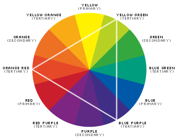
Color Wheel Guide to Paint Colors

Photo of color wheel by Jasmic/Flickr.
Paint can mean the difference between a decorating success, and a big DIY disaster. But using a color wheel as a guide to picking your colors can help both the novice and the professional in understanding color relationships, and how to best employ them in a design scheme.
Primary, Secondary and Tertiary Colors
Starting with the basics of the wheel, there are the three primary colors – red, blue, and yellow. These primaries combine to make the three secondary colors – orange, green, and violet, and also the six tertiary colors, like yellow-green and red-violet.
Color Terminology
When it comes to choosing paint for a project, it also helps to understand color terminology. The hue is the basic color; for instance, canary and banana and daffodil all share the same yellow hue. The tone accounts for the density and reflectivity, and is what most laypeople mean when they say “shade.” And finally, the saturation describes the intensity of the color, how pure and strong it reads.
Warm and Cool Colors
Finally, colors can be divided into two families – warm and cool. The warm family generally includes reds, oranges, yellows, and browns. The cool family encompasses the other side of the wheel: blues, greens, and violets. Warm colors are most often associated with comfort and strength, while cool colors invite feelings of serenity and security. When painting and decorating, it helps to mix a cool color with a warm color. This will create a natural balance.
Complementary Colors
With this basic understanding, you can use the color wheel as a guide to paint colors. For example, you can’t go wrong with a complementary color scheme. This is done by choosing colors on directly opposite sides of the wheel, such as cobalt + marigold or buttercup + lilac. These combinations excite the eye while allowing each hue to really POP, much more than if you were to pair either one with a simple neutral, like white or cream. Complementary colors will always bring out the best in one another.
Split Complementary Colors
For a scheme that’s a little bit more advanced, try using split complementary colors to design cohesive and dynamic space. For a split complementary color scheme, first settle on a main color that you really love. Then locate its complementary color, but instead of using the actual compliment, select the colors just to either side of it. This triple color combo will provide the road map for a rich, layered look.
Monochromatic or Related Colors
If you want to go in another direction entirely, you could eschew the stark contrasting effect of complementary colors (and split complementing), and instead opt to layer related, or monochromatic, colors. Related hues are those that fall right next to each other on the wheel, and monochromatic schemes are those that work entirely within one hue. By combining related colors you can achieve a calming, organic effect (imagine various shades of blue and blue-green evoking the ocean, or a collection or oranges and reds mimicking the warmth of a fire). And monochromatic looks, when done right, create a very stylish and chic aesthetic.
One Statement Color
Also, remember that you don’t always have to work in a multi-colored paint scheme. If you want to choose one statement color and stick to the traditional white/cream/grey compliments (baseboards, frames, cabinets, etc), by all means have at it. But then, a color wheel can guide you to select your accent colors as you furnish and personalize the room. A big bright red vase, for example, in an emerald-walled room, is quite a powerful visual statement.
Clearly, there’s a whole lot that goes into selecting and carrying out a cohesive color scheme. And that’s why the color wheel guide to paint colors can be such a useful tool. Just like a little cheat sheet, use it to choose your ideal colors. Then, whether you do the actual paintwork yourself or hire a contractor, you'll end up with a very professional-looking result.
Updated April 19, 2018.
Looking for a Pro? Call us (866) 441-6648

Painting Average Costs
Painters Experiences

Really, Really Beautiful Paint Job On Bedroom With Vaulted Ceiling

Bathroom Ceiling Painting And Repair Required By Mortgage Lender


