How to Choose Interior Color Schemes
 As a decorator, I've noticed that the single biggest source of fear and angst for homeowners when they are decorating is the selection of paint colors. This is one reason why so many homes are painted white or off-white; people fear getting it wrong and living with the mistake. It's a pity, because paint is the least expensive part of a home's interior decor, especially for DIY types. In fact, the biggest mistake people make is not the actual color selection, it's starting with the paint color first. If that sounds counterintuitive, let me explain.
Our homes are made up of a lot more than the color on our walls. There are floors, furniture and window treatments to consider. And, of course, in the kitchen and bath, we have cabinetry, counter surfaces and appliances that play important roles. The most successful color schemes require that we consider the whole and then determine the details.
When I am working with a decorating client and we're coming up with a color scheme for a single room, I take into consideration what's going on in adjoining rooms. That doesn't mean that each room has to be the same color, but there should be some relationship between the rooms. Once I've taken inventory of the fixed colors (those that will not change), I start pulling together ideas for colors that work well with them. Here are a few ways to inspire a color scheme:
- Books, magazines, Websites and blogs: These publications are filled with the work of highly trained professionals. Pull together a file of clippings of color combinations that you find appealing. You may be surprised at what you find out about yourself and you will most certainly be inspired to try new things.
- Paint companies spend lots of money creating color schemes. Why not use their expertise? Sherwin Williams, for instance, has created color collections by historical era from Colonial to Arts and Crafts. This is a great way to take advantage of professional advice for free. They've done much of the work for you.
- Color matching technology is now available to all of us. All the major paint companies have iPhone applications that let you take a photo of something (a flower, a piece of fabric) and the application will match the item to a paint and recommend coordinating colors. How easy is that? If you don't have an iPhone, then you can always bring the item you wish to match to a paint store and have the staff help you. There are also online color visualizer tools that let you see how different colors work together, even allowing you to upload a photo of your room.
- An easy and safe rule of thumb is that each room should have one main color and two secondary ones. Different shades of these colors can be incorporated for additional interest without turning things into a mishmash of color.
- Beige is not just beige. Learn to "see" the colors and not just listen to the name. There are pink beiges and yellow beiges and green beiges and if you take the time to really see the colors, you will start seeing how these differences can make or break your design.
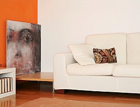
Photo credit: Precision Painting Plus


Looking for a Pro? Call us (866) 441-6648

Painting Average Costs
Painters Experiences

Toilet Replacement + Grab Rails = Access For Disabled Homeowner

Interior Painting For Our First Newlywed Home